Making data beautiful – or extracting beauty from data.

I think I touched on this a while back but there was a time where digital art was made by scientists. Then there was a time where designers got to play. After they both had their independent stabs at it, they merged. That became the time of infographics. 

At first it was really interesting as people took large data sets and made beautiful things. It became a thing. Then people realized the great populace would stop their scrolling to look at such things. Then the great dumbing of Marketing happened. The world of pretty and challenging data representations drowned in the tide of ‘infographics’ that merely consisted of a few icons and a few figures. 

Sigh. It was a good time back in the day.

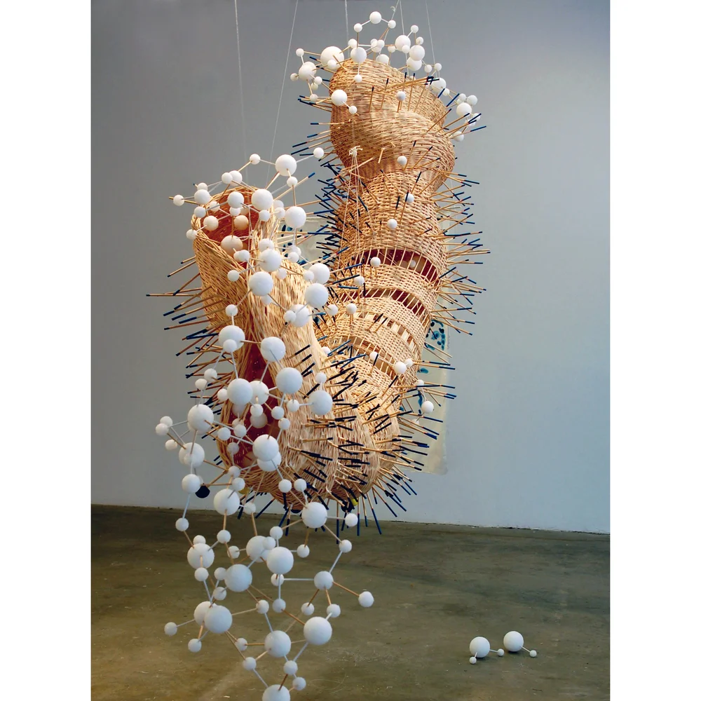
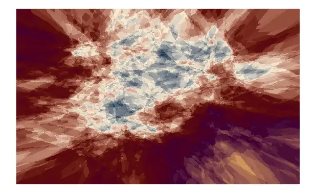
Every once in a while someone starts making really amazing data-derived art. Today we can look at Nathalie Miebach’s work that’s built with data sets from weather patterns and COVID data. 

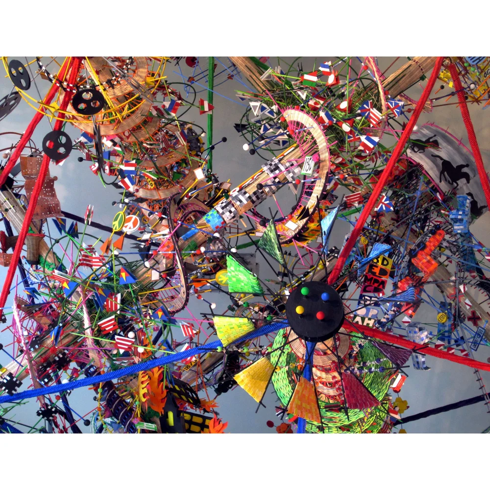
The intriguing part of the work is that it exists from techniques far away from the conventional data art stuff. What I would describe as sculptural assemblages that even include weaving features to tell the story of that data. I find them to be incredible – especially as they burst out of the two-dimensional world where most data-based art lives. You have to check out more of her work.

Miebach’s work gives me hope that maybe others could again take the large data sets that make up our world and our experiences to produce something at least interesting to look at. Now, that could be a bit easier as there’s a way one could torture the data for art using the programming language R (yeah, I know we could have an argument about whether R is merely a scripting language or an actual programming language, but whatever).

Saúl Buentello takes you through how to use the packages in his article on Towards Data Science. I’d add more links but you really want to step through with Saúl and read how things work. The instructions on that link and the information on GitHub is really well done. Maybe you can create beauty from mere reporting, as well.

Code as Poetry, Poetry as Code?

Code Poetry Slam, sponsored by Stanford University’s Division of Literatures, Cultures, and Language

An article written as a conversation, Code and Poetry, a conversation lays the foundation for opening the door to allowing the thinking that both concerns are perhaps the same thing. I’d really like it to take the thought process a bit further and explore the ‘art’ of code or the programmatic rule sets that poetry pursuits find themselves operating within to intertwine the two further but it’s nice nonetheless to set the mind to accept the concept that code perhaps is a form of poetry as form in itself beyond what it achieves on execution.

Would code eventually be written for artistic qualities rather than functional in the future? Will there be a programming language developed that is functional but has the constructs of a villanelle or other ‘conventional’ poetic form?  Or some sort of combination of both? Interesting to think about…

The Process of Designing a Data Visualization Project

Way back in the day – about the aughts – I remember when digital art really became a thing. The tools were in abundance, like Processing.org and Flash. Both had the relatively new and approachable ability to actually program an art piece. It was an game changing ability. This brought digital art out of just being an extension of hand techniques into something truly new.

First, random data was used to manifest projects.  We searched through endless machine-made permutations to find something worthy of hanging the word ‘art’ onto. Certainly we got to the point where we realized that there was no soul in random noise, no matter how pretty it looked. Artists then used datasets from real things to build digital works.

Things got a bit more meaningful.  What really happened was a whole new job category was developed. Much like how headphone drum and bass was swallowed up by more dancy-ier explorations, the digital artist was swallowed up by it’s more useful child, data visualization. Suddenly science couldn’t live without art anymore.

Why the devolvement? Well Peter Beshai has written a really great article for Medium that takes the reader through the process of developing some truly amazing visualization of Twitter conversations. I’d say that these visualizations certainly move into the art category.  

Perhaps the best part is that Peter has done us a solid of name dropping and even link dropping the technologies and the theory work that went into the project. Even better, he’s given the article a step-by-step visual record of the path taken to get the end result. Just the sort of article for sharing here at OfPeculiarUtiltiy.