
I’d think virtually every artist’s path includes a bit of research in previous artists. Then there’s a time where that growing artist takes on elements of the previous artist and melds it into their own works. Some even start to extend the previous artist’s work with their own. Sometimes the connection is so strong that artists feel they understand the previous artist’s path enough to take it to where it needs to go. A lot of artists choose Abstract Expressionist artists for this. I even saw an article that engineers and scientists used Jackson Pollack as inspiration for a new 3D printing technique. I’d say it’s pretty common.
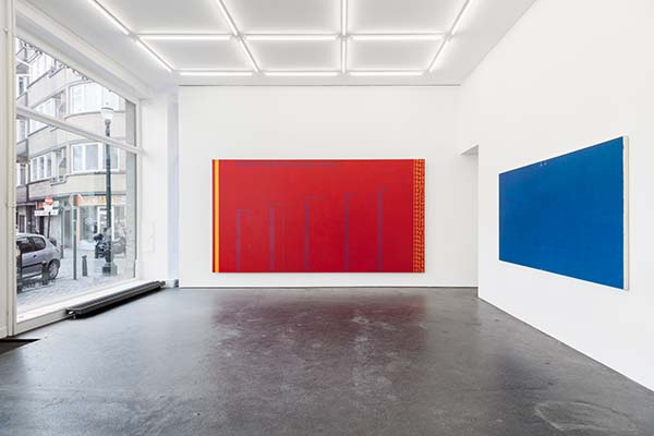
David Diao’s work is the first time I’ve seen the conversation between current and a previous artist unfold in what appears to be a more clinical fashion where the current artist’s work grows from the previous by being an analysis of what the other has done, as Diao has done with Barnett Newman.
.

Certainly artists have done homages and created work that comments on the prior’s output. That appears not to be the case here. From the pieces provided in the links I found, the body of work looks to be almost infographical about Newman’s life and works. This also sort of rhymes with The Art of Noise’s Seduction of Claude Debussy. AoN leads us through Debussy’s life and samples his work to present it in their album. In both, we are offered only a small amount of the history and catalog to consider. We are to infer something about the work and gather our own thoughts about what is presented – obviously this fits in tightly with the Abstract Expressionist movement.
When taking in the extent of the work presented, I think there’s a lot to consider here. Is it a ‘new’ sort of art that’s more storytelling than abstract art ever pretended to be? Is it more graphic design coming of age as a ‘fine art’? Is it neither? Both? The Hyperallergic article draws in a vast swathe of connecting thoughts that extends a potentiality of thoughts to consider. I can’t speak to the voracity of those aspects and details, as I did just a modicum of research myself.
This all goes back to what I really wanted this site to do: present interesting artistic endeavors. In my mind, Diao’s work absolutely does present a cognitive workout for the viewer – only through time-tested flat art mediums rather than fancy tech-based processes.